I will convert your Figma design to responsive HTML CSS code
About this gig
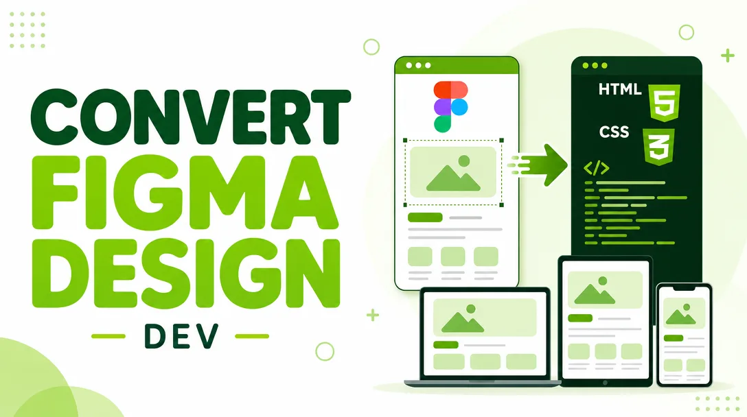
I will convert your Figma design into clean, responsive, hand-written HTML and CSS that looks pixel-accurate on desktop, tablet, and mobile. You share the file, I ship production-ready code.
What you get
- A complete, responsive HTML + CSS build of your Figma design, hand-coded (no page-builder export, no bloated auto-generated markup).
- Pixel-accurate layout that matches your frames — spacing, typography, colors, and component states checked against your design tokens.
- Mobile, tablet, and desktop breakpoints built with Flexbox and CSS Grid, so the page reflows cleanly instead of just shrinking.
- Semantic, accessible markup — proper heading order,
alttext on images, labeled form fields, and sensible landmark elements. - Cross-browser tested output that works in current Chrome, Firefox, Safari, and Edge.
- Web fonts wired up (Google Fonts or self-hosted files you provide) to match your typography exactly.
- Optimized, organized assets — exported icons and images, SVGs where it makes sense, and a tidy folder structure.
- Clean, commented code with consistent class naming (BEM or your preferred convention) that your team can read and extend.
- Interactive states such as hover, focus, and active styling on buttons, links, and inputs.
- A short handover note explaining the file structure and how to edit common things.
Optional add-ons depending on the plan: basic vanilla-JS interactions (mobile menu toggle, accordion, simple slider, smooth scroll), a contact form layout, and a reusable component structure.
Plans
| Feature | Basic | Standard | Premium |
|---|---|---|---|
| Sections / screens | 1 page, up to 3 sections | 1 page, up to 7 sections | Multi-page or landing page, full design |
| Responsive breakpoints | Desktop + mobile | Desktop + tablet + mobile | Desktop + tablet + mobile, fine-tuned |
| Pixel-accurate match | Yes | Yes | Yes |
| Semantic & accessible markup | Yes | Yes | Yes |
| Cross-browser testing | Yes | Yes | Yes |
| JavaScript interactions | — | Basic (menu, simple toggle) | Yes (menu, sliders, accordions, etc.) |
| Web fonts & icon setup | Yes | Yes | Yes |
| Reusable component structure | — | — | Yes |
| Source files & handover note | Yes | Yes | Yes |
| Revisions | Included | Included (more) | Included (most) |
How it works
- Send your Figma file. Share a view or edit link to the published design, and let me know which frames are in scope and which breakpoints you care about.
- Quick scope check. I review the file, confirm the sections, fonts, and assets, flag anything ambiguous (missing states, undefined mobile layouts), and agree on the plan with you.
- Asset export & setup. I pull icons, images, and SVGs from your file, set up the project folder, fonts, and a CSS reset/base.
- Build. I hand-code the markup and styles section by section, matching spacing, type, and color to your design tokens as I go.
- Responsive pass. I add and tune breakpoints so the layout works from small phones up to wide desktops.
- QA & cross-browser test. I check the build against your frames, test in the major browsers, and verify states and accessibility basics.
- Delivery & revisions. You get the files, review against your design, and I make the agreed revisions until it matches.
Why choose this
I write code by hand, so you get markup you can actually maintain — not a thousand nested <div>s from an auto-export tool. I treat your Figma file as the single source of truth: if a value is in the design, it ends up in the CSS, and if something is undefined (like a hover state or a narrow-screen layout), I ask instead of guessing. The result is a build that matches your design, behaves predictably across devices and browsers, and is genuinely handover-ready for your developers or your CMS.
I also care about the details that often get skipped: consistent spacing scales, real focus styles for keyboard users, sensible image compression, and class names that read like English. That means less rework for you later and a front end that's pleasant to extend.
Who it's for / use cases
- Founders and startups who have a polished Figma design and need it turned into a real, working front end.
- Designers who want their work coded faithfully without learning to build it themselves.
- Agencies needing reliable, clean HTML/CSS slices to drop into a larger project or hand to their backend team.
- Marketing teams shipping landing pages, product pages, or campaign microsites from a finished mockup.
- Developers who want the static front end built so they can focus on integration and logic.
Typical projects: landing pages, marketing and product pages, portfolios, email-capture and coming-soon pages, dashboards' static front ends, and individual sections (hero, pricing, features, footer) you want sliced precisely.
FAQ
Q: What do you need from me to start? A published Figma link with view or edit access, a note on which frames are in scope, and your target breakpoints. If you have font licenses or specific assets, share those too.
Q: Will the result match my design exactly? Yes — I build to match your frames closely, checking spacing, type, and color against your design. Where the design leaves something undefined (like a tablet layout or a hover state), I'll confirm with you rather than improvise.
Q: Is the HTML and CSS hand-written or exported from a tool? Hand-written. You get clean, semantic, commented code with consistent class naming, not auto-generated markup that's hard to maintain.
Q: Does this include JavaScript? Basic vanilla-JS interactions (mobile menu, toggles, simple sliders, accordions) are available on the Standard and Premium plans. This service focuses on the front-end markup and styling — it does not include backend logic, databases, or form submission handling.
Q: Will it work on mobile and in all browsers? Yes. I build responsive breakpoints for desktop, tablet, and mobile, and I test in current Chrome, Firefox, Safari, and Edge before delivery.
Q: Can you build it on a specific framework like Bootstrap or Tailwind? The default delivery is clean custom HTML and CSS. If you need a specific CSS framework or want it structured for a CMS, message me first so I can confirm scope before we begin.
Q: How do revisions work? Each plan includes revisions. After delivery you review the build against your design, and I adjust until it matches the agreed scope. Changes that go beyond the original design (new sections, added pages) can be handled as an extension.
Q: How do I receive the final files? You get the complete project as organized source files — HTML, CSS, JavaScript if included, and the exported assets — along with a short handover note explaining the structure and how to make common edits.
Reviews★4.6(10)
- @kaidev★★★★★5
The markup was semantic and the CSS was easy to read, made it simple for my dev team to take over from there.
- @norastudio★★★★★5
Converted three of my Figma screens into responsive pages and everything lined up exactly. Smooth on every screen size I tested.
- @pixelwave★★★★★5
Honestly nailed it, the layout reflows beautifully and the CSS is super clean. Way better than coding it myself.
- @irisi★★★★★5
Pixel-perfect match to my Figma file and it scaled cleanly from mobile to desktop. Really impressed with how clean the HTML and CSS turned out.
- @ninamedia★★★★★4
Solid responsive build from my Figma frames. Fonts and colors all matched, just had to point out one image that wasn't sizing properly.
- @jackw★★★★★4
Good conversion overall, the responsive breakpoints worked well. Took one extra round to fix a small spacing issue on tablet but he sorted it out.
- @alexg★★★★★5
Sent over a landing page design and got back tidy, well-organized code that looked identical on my phone and laptop.
- @ivy2019★★★★★5
Fast turnaround and the HTML matched my design down to the padding. Tested it on a few devices and it held up great.
- @pixelcraft★★★★★3
The code worked and matched the design, but I had to ask for a few adjustments on the mobile menu styling before it felt right.
- @wavex★★★★★5
He turned my multi-section Figma design into working HTML and CSS that matched perfectly. Will definitely come back for the next page.