I will create a dynamic Tableau dashboard and data visualization story
About this gig
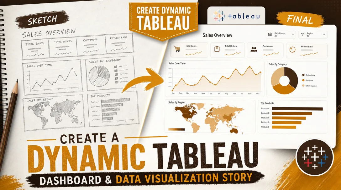
I will create a dynamic Tableau dashboard and data visualization story that turns your raw spreadsheets into a clear, interactive, decision-ready analytics experience.
If your data lives in scattered CSVs, exported reports, or a database nobody enjoys querying, this service gives you a polished Tableau workbook that anyone on your team can actually use. I design dashboards that answer real business questions, not just charts that look pretty in a screenshot.
What you get
- A fully built Tableau workbook (.twbx packaged file) connected to your data source, ready to open in Tableau Desktop, Tableau Public, or publish to Tableau Server / Tableau Cloud.
- One or more interactive dashboards with working filters, parameters, highlight actions, and drill-downs so users can explore on their own.
- A guided data visualization "story" (Tableau Story Points) when you want a narrative walkthrough: context, key finding, supporting detail, and recommended action, in a logical sequence.
- Clean, documented calculated fields (KPIs, ratios, period-over-period change, running totals, rank, cohort or retention logic) with comments so future edits are painless.
- Thoughtful chart selection: bar, line, dual-axis, scatter, heatmaps, maps (filled or symbol), bullet graphs, KPI tiles, small multiples, and tables, each chosen because it fits the question, not because it looks flashy.
- A consistent visual layout: aligned containers, a tidy color palette (brand colors on request), readable typography, tooltips that explain the numbers, and mobile/desktop layout tuning where the plan includes it.
- Light data preparation: joins, blends, pivots, basic cleaning, type fixes, and date handling so the workbook actually runs on your file as delivered.
- A short walkthrough document or annotated screenshots explaining how each filter and view works, plus a recorded screen walkthrough on higher plans.
Plans
| Feature | Basic | Standard | Premium |
|---|---|---|---|
| Interactive dashboards | 1 dashboard | Up to 2 dashboards | Up to 4 dashboards |
| Data sources connected | 1 source | Up to 2 sources | Multiple sources (joins/blends) |
| Calculated fields & KPIs | Core KPIs | Advanced calcs & parameters | Full calc suite, LOD expressions, sets |
| Filters & interactivity | Basic filters | Filter + highlight actions, drill-down | Full actions, dynamic parameters, navigation |
| Data story / Story Points | — | Optional add-on | Included narrative story |
| Data cleaning & prep | Light | Moderate | Thorough (pivots, blends, reshaping) |
| Brand styling | Standard palette | Brand colors & fonts | Full custom design system |
| Walkthrough | Notes | Annotated guide | Recorded video walkthrough |
| Revisions | 1 round | 2 rounds | 3 rounds |
| Publishing help | — | Tableau Public | Public / Server / Cloud |
How it works
- Share your goal and data. Send me your dataset (CSV, Excel, Google Sheets, or database access) and tell me the questions the dashboard must answer and who will use it.
- Scoping and quick plan. I confirm the metrics, the views, the level of interactivity, and which plan fits. If the data needs reshaping, I flag it up front so there are no surprises.
- Data preparation. I connect the source, fix data types and dates, build joins or blends, and create the calculated fields and KPIs your analysis needs.
- Design and build. I build the charts, assemble the dashboard layout, wire up filters, parameters, and actions, and apply your color and font choices.
- Story assembly (Standard add-on / Premium). When a narrative is included, I sequence the views into Story Points that lead the reader from context to insight to action.
- Review and revise. You get a preview and a walkthrough. I refine wording, colors, layout, and logic within your plan's revision rounds.
- Handover. I deliver the packaged .twbx, source files, documentation, and, on higher plans, help publishing to Tableau Public, Server, or Cloud.
Why choose this
I treat a dashboard as a tool, not decoration. Every view is built to answer a specific question, and the layout is designed so a busy stakeholder finds the answer in seconds. The calculated fields are commented, the structure is clean, and the workbook is built to be maintained, so when your data updates next quarter, the dashboard keeps working and your team can extend it without reverse-engineering my choices. I also keep performance in mind: extracts over slow live connections where it helps, context filters to speed up rendering, and aggregated views that load quickly even on larger files.
Who it's for / use cases
- Founders and operators who need a single source of truth for sales, revenue, churn, or pipeline.
- Marketing teams tracking campaign performance, channel attribution, funnel conversion, and spend.
- Finance and operations reporting on budget vs. actuals, cash flow, inventory, or unit economics.
- Product teams visualizing usage, retention, cohorts, and feature adoption.
- HR and people teams monitoring headcount, attrition, and hiring funnels.
- Analysts and consultants who need a presentation-grade Tableau story to deliver findings to a client or board.
- Students and researchers who need survey or experimental data turned into a clear visual narrative.
FAQ
Q: What data formats can you work with? I work with CSV, Excel, Google Sheets, and common databases (PostgreSQL, MySQL, SQL Server, Snowflake, BigQuery) when you provide access. If your data is messy or split across files, I'll consolidate and clean it as part of the build.
Q: Do I need a paid Tableau license to use the dashboard? To edit the workbook you'll need Tableau Desktop, but you can open and explore packaged workbooks in the free Tableau Reader, and I can publish to free Tableau Public if your data isn't confidential. For private sharing you'll need Tableau Server or Tableau Cloud.
Q: Will the dashboard refresh automatically when my data changes? If your file structure stays the same, you can swap in new data and the views update. For automatic scheduled refreshes, that runs through Tableau Server or Cloud, and I'll set up the extract and refresh schedule on the Premium plan or as an add-on.
Q: Can you match my brand colors and fonts? Yes. Send a style guide or a few hex codes and a logo, and I'll apply your palette, fonts, and spacing so the dashboard looks like it belongs to your company.
Q: What if I don't know exactly what charts I need? That's fine and common. Tell me the questions you want answered and the decisions you're trying to make, and I'll recommend the right metrics and chart types. Choosing the right visualization is part of the service.
Q: Can you build a presentation-style data story, not just a dashboard? Yes. Using Tableau Story Points I can build a guided narrative that walks a reader through context, the key finding, supporting evidence, and a recommended action, ideal for board decks, client reports, and stakeholder reviews.
Q: How many revisions are included and what counts as one? Revisions are listed per plan above. A revision round is a consolidated set of change requests (colors, labels, layout, calculation tweaks) sent together. Adding brand-new dashboards or new data sources beyond the agreed scope is a separate add-on.
Q: How do you handle confidential data? I treat your data as private and can work with anonymized or sample data if you prefer. I won't publish anything to public platforms without your explicit go-ahead, and I'm happy to delete source files after delivery on request.
Reviews★4.6(9)
- @lab88★★★★★4
Solid work on a healthcare patient-volume dashboard. The visualizations were sharp and the storytelling flow made sense, though I needed one round of revisions to fix a couple of date-range filters. Responsive throughout and got it sorted quickly.
- @avam★★★★★3
The final dashboard looks good and the connections to our Excel source work, but it took longer than the quoted turnaround and the early drafts had some misaligned chart labels. Got there in the end after a few back-and-forth messages.
- @eli_r★★★★★5
Outstanding from start to finish. They took our nonprofit's donor data and built a compelling dashboard plus a narrative story that we used in our board presentation, and the revisions were turned around same day.
- @dan21★★★★★5
I sent over raw e-commerce CSV exports and got back a polished, story-driven Tableau dashboard with cohort and funnel views. The tooltips and color choices are professional and our whole team can actually read the data now.
- @mason_media★★★★★5
Turned our messy retail sales spreadsheet into a clean interactive Tableau dashboard with drill-downs by region and product line. The data story walked our executives through the trends without me having to explain a thing.
- @alexz★★★★★5
Exactly what our marketing team needed. Built a dynamic dashboard tracking campaign ROI across channels and the filters work flawlessly.
- @ria_q★★★★★5
Great Tableau work for our logistics dashboard. The dynamic parameters let our ops managers switch between warehouses on the fly.
- @amir_codes★★★★★5
Delivered a full financial KPI dashboard ahead of the deadline. Loved how the data story guided viewers from the high-level summary down to the transaction detail. Communication was prompt and they understood my requirements immediately.
- @finn_pro★★★★★4
Built a clean SaaS subscription metrics dashboard with churn and MRR breakdowns. Good communication and the dynamic filtering is smooth. Knocked off one star only because I'd have liked a short walkthrough video, but the dashboard itself is excellent.