I will write UX microcopy and in-app text that guides your users
About this gig
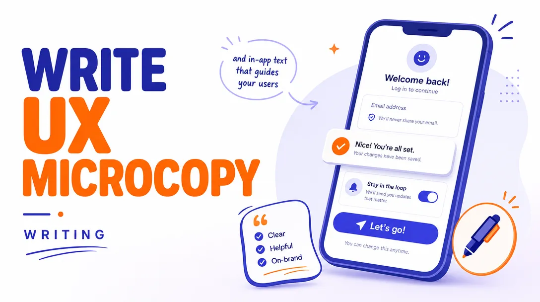
I will write UX microcopy and in-app text that guides your users through every screen, button, and empty state so the product feels effortless and obvious.
What you get
Clear, purposeful words placed exactly where your interface needs them. I write the small text that does the heavy lifting in any digital product: button labels, form field hints, error and validation messages, empty states, tooltips, onboarding flows, confirmation dialogs, success toasts, and the in-app guidance that keeps people moving instead of guessing. Every line is written to match how your users actually think, in plain English that reduces hesitation, support tickets, and abandoned tasks.
- Button and CTA labels that say what happens next, no vague "Submit" or "Click here" when something more specific will convert better.
- Form microcopy including field labels, placeholder text, inline helper hints, and friendly-but-clear validation and error messages.
- Empty states that turn a blank screen into a nudge toward the first useful action.
- Onboarding and first-run copy that orients new users without overwhelming them, including tooltips, coach marks, and step-by-step prompts.
- System and status messages: success confirmations, loading and progress text, warnings, and graceful error recovery wording.
- Modal, dialog, and confirmation copy so destructive or important actions are unmistakable.
- Notifications and microcontent: badges, banners, toasts, and the tiny labels that stitch a flow together.
- A delivery file (Google Doc, spreadsheet, or your preferred format) that maps every string to its screen or component, with context notes so your developers and designers know exactly where each line belongs.
- Two voice/tone options on key strings where a decision matters, so you can pick the direction that fits your brand.
- A short rationale explaining notable wording choices so the copy is easy to defend and reuse.
This is hands-on writing work delivered as organized, ready-to-implement text. I do not build or design the interface itself; I supply the words and the placement guidance your team drops into the product.
Plans
| Feature | Basic | Standard | Premium |
|---|---|---|---|
| Scope | A single flow or screen set | A multi-screen feature or section | A full product or app's core flows |
| Screens / flows covered | Up to ~3 screens | Up to ~8 screens | Up to ~20 screens |
| Microcopy types | Buttons, labels, errors, empty states | Everything in Basic + onboarding, tooltips, system messages | Everything in Standard + notifications, edge cases, voice & tone guidance |
| Mapped delivery doc | Yes | Yes | Yes |
| Voice/tone alternatives on key strings | — | Yes | Yes |
| Lightweight style/voice notes for reuse | — | Short summary | Full mini style sheet |
| Revision rounds | 1 | 2 | 3 |
| Context/research review | Brief | Standard | In-depth |
How it works
- You share context. Send me your screens, mockups, prototype links, current copy, or even a written description of the flow. Tell me your audience, the action you want users to take, and any brand voice you already use.
- I review and ask questions. I look at where users get stuck, what each screen is asking of them, and what tone fits. I'll send a short list of clarifying questions if anything is ambiguous.
- I write the copy. I draft every string, tied to its specific screen or component, written to guide the user toward the next clear action with minimal friction.
- I deliver a mapped document. You receive an organized file where each line of text is matched to its location, with context notes and, on Standard and Premium, alternate options on the strings that matter most.
- We refine. You review and request changes within the revision rounds for your plan. I adjust wording, tone, and length until the copy fits your interface and your voice.
- You implement. The final copy is ready for your developers and designers to drop straight into the product.
Why choose this
Microcopy is small in word count but large in impact. The difference between a user finishing a signup and rage-quitting it often comes down to a single error message or an unclear button. I write with that stakes-per-word reality in mind: every string earns its place. I focus on clarity first, personality second, so the copy works for real people under real conditions, including the moment something goes wrong. You get text that is consistent across screens, honest about what each action does, and easy for your team to implement because it arrives already mapped to your interface. No filler, no clever-for-its-own-sake wording that confuses, and no copy written in a vacuum away from the actual flow.
Who it's for / use cases
- SaaS and web app teams launching a new feature who need every label, hint, and message to feel coherent.
- Startups preparing for a first release who want onboarding and core flows to convert and retain.
- Product and design teams without a dedicated UX writer who need a reliable hand for the words inside the interface.
- Mobile app makers tightening up button labels, error states, and notifications before submitting to the stores.
- Teams fixing a leaky funnel where users drop off at forms, paywalls, or empty states and the wording is the suspect.
- Founders rewriting clunky or inconsistent in-app text inherited from an MVP or a previous draft.
FAQ
Q: What exactly is UX microcopy? It's the small, functional text inside a product: button labels, form hints, error messages, empty states, tooltips, confirmations, and onboarding prompts. It guides users through actions, unlike marketing copy, which is about persuasion on a landing page.
Q: Do you design or build the screens too? No. I write and organize the words and tell you where they go. The visual design and development stay with your team. I deliver copy that slots cleanly into whatever you've built or designed.
Q: What do you need from me to start? Ideally your mockups, prototype, or live product so I can see the flows in context. If you don't have visuals yet, a written description of each screen and the action you want users to take works too.
Q: How do you handle brand voice? If you have voice guidelines or example copy, I'll match them. If you don't, I'll infer a fitting tone from your product and audience and, on Standard and Premium, hand back lightweight voice notes so future copy stays consistent.
Q: Can you work with an existing design tool like Figma? Yes. Share a view or export link and I'll reference the screens directly. I deliver the final copy in a clearly mapped document so anyone can transfer it into the design or codebase.
Q: How are revisions handled? Each plan includes a set number of revision rounds. Send your feedback in one consolidated pass per round and I'll refine wording, tone, and length to fit. Most copy lands within the included rounds.
Q: Do you write in languages other than English? I write in English only. If you need translated or localized copy, I'd recommend writing the English source with me first, then handing it to a native localizer for each target market.
Q: What format will I receive the copy in? A structured document, typically a Google Doc or spreadsheet, where every string is paired with its screen or component plus a short context note. I can match a specific format if your team prefers one.
Reviews★4.5(2)
- @ninamedia★★★★★4
Solid microcopy for our signup flow and in-app prompts, the tone matched our brand well. Took a quick revision round to tighten a couple of the form hints but happy with the final text.
- @sophia7★★★★★5
The button labels, empty states, and error messages he rewrote are so much clearer now, and our onboarding tooltips actually make sense to first-time users. Really thoughtful work.