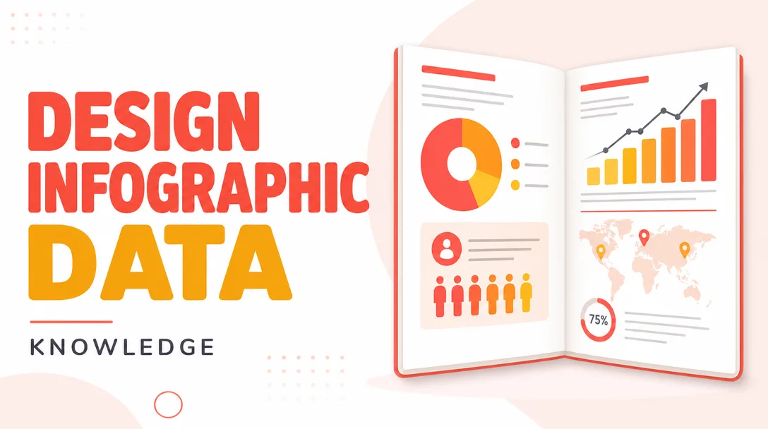
I will design infographic data visualizations and charts for your ebook or report
About this gig
Turn dense data into clear, on-brand infographics, charts, and data visualizations that make your ebook or report easier to read, trust, and share.
I design custom infographics and data visualizations for ebooks, whitepapers, annual reports, research briefs, and lead magnets. Whether you have a messy spreadsheet, a survey export, or a rough sketch on a napkin, I turn the numbers into clean, accurate, print-ready and screen-ready graphics that fit your document and your audience.
What you get
- Custom data visualizations built from your real numbers: bar, column, line, area, pie/donut, stacked, grouped, scatter, bubble, waterfall, funnel, gauge, radar, and combination charts.
- Editorial infographics that combine icons, short text, stats, and layout into a single explanatory graphic (process flows, timelines, comparison tables, "by the numbers" panels, geographic/map-style callouts).
- Consistent visual system across every graphic in your document: shared color palette, type styling, label conventions, legend placement, and number formatting so the whole report reads as one piece.
- Accurate, labeled charts: correct axes, units, data sources cited where you provide them, sensible rounding, and readable legends — no misleading scales or truncated axes unless you specifically request it.
- Layout-ready output sized to your page (US Letter, A4, slide, or a custom dimension you specify) with proper margins and bleed where needed.
- Editable source files on the relevant tiers, so your team can update a figure later without starting over.
- Final exports in the formats you actually need: print-ready PDF, high-resolution PNG, and vector SVG. Transparent backgrounds available on request.
- A short handoff note explaining the file structure, fonts used, and how to swap data or colors later.
This is a digital delivery gig: you receive downloadable files. Nothing is mailed, and there is no live hands-on session — all collaboration happens through written briefs, shared data, and revision rounds.
Plans
| Feature | Basic | Standard | Premium |
|---|---|---|---|
| Number of graphics | 1 visualization | Up to 5 graphics | Up to 12 graphics |
| Chart types | Single standard chart | Mixed charts + 1 infographic | Full mix: charts, infographics, flows, maps |
| Custom color & brand styling | Basic palette match | Full brand styling | Full brand system + reusable template |
| Source data prep | You provide clean data | Light cleanup included | Cleanup + restructuring of raw exports |
| Editable source file | — | Included | Included |
| Export formats | PNG + PDF | PNG + PDF + SVG | PNG + PDF + SVG + transparent assets |
| Revisions | 1 round | 2 rounds | 3 rounds |
| Style/figure guide for reuse | — | — | Included |
If your project sits between tiers or needs a one-off volume that none of these match, message me first and I'll outline a fitted scope before you order.
How it works
- Share your brief and data. Send the raw numbers (spreadsheet, CSV, survey export, or even a screenshot), the document they'll live in, your page size, and any brand assets — logo, hex codes, fonts. Tell me the story each figure should tell.
- Scope confirmation. I confirm the number of graphics, chart types, dimensions, and which tier fits. If anything in the data is ambiguous or contradictory, I flag it before designing rather than guessing.
- Structure and draft. I clean and structure the data, choose the clearest chart type for each data set, and produce first-draft visuals with correct labels, units, and a consistent visual system.
- Review and revise. You review against the brief and request changes within your tier's revision rounds — colors, labels, chart choice, emphasis, layout.
- Final delivery. I export the approved graphics in your chosen formats, include editable source files where your tier covers them, and send a short handoff note so your team can update figures later.
Why choose this
- Clarity over decoration. The goal is comprehension. I pick the chart type that reveals the pattern in your data, not the flashiest one — and I keep visual noise low so the insight lands fast.
- Honest data handling. Axes start where they should, scales are proportional, and I don't bend a visual to overstate a result. Your report stays credible.
- Print- and screen-aware. Files are built at the right resolution and color setup for the medium, so charts stay crisp whether the ebook is read on a phone or printed in a bound report.
- One coherent look. Every figure in your document shares a system, which is what separates a polished report from a deck of mismatched screenshots.
- Editable, not locked. On Standard and Premium you get source files, so you aren't dependent on me for a future number update.
Who it's for / use cases
- Content marketers and agencies producing gated ebooks, lead magnets, and whitepapers that need professional figures.
- Founders and consultants packaging research, survey results, or market analysis into a credible report.
- Nonprofits and associations publishing annual reports and impact summaries with budget, outcome, and trend data.
- Analysts and researchers who have solid numbers but need them visualized clearly for a non-technical audience.
- Authors and publishers of non-fiction and how-to ebooks that lean on statistics, comparisons, and step-by-step processes.
- SaaS and B2B teams building "state of the industry" reports, benchmark studies, and data-driven blog-to-ebook conversions.
Typical pieces include a survey results breakdown, a year-over-year revenue or growth chart, a comparison of options, a process or methodology flow, a timeline of milestones, and a "key findings at a glance" stat panel.
FAQ
Q: What format should I send my data in? A clean spreadsheet (Excel or Google Sheets) or a CSV is ideal, with one clear column per series and labeled headers. I can also work from survey-tool exports, tables in a document, or a clear screenshot — just expect a little extra cleanup time on raw exports, which is covered on Standard and Premium.
Q: Can you match my existing brand or document style? Yes. Send your hex codes, fonts, and a sample page or two, and I'll match the palette, type, and overall feel so the new graphics blend into your existing report rather than clashing with it.
Q: Will the charts be editable later? On Standard and Premium you receive editable source files plus a handoff note, so your team can update numbers, labels, or colors without redrawing the graphic. Basic delivers final exports only.
Q: Can you handle interactive or animated charts? This gig covers static graphics for documents — print-ready PDF, PNG, and SVG. Interactive dashboards or animated/web-embedded charts are a different kind of build; message me and I'll tell you honestly whether I can help or point you to the right scope.
Q: What if my data is messy or incomplete? Send it anyway. I'll review it and flag gaps, duplicates, or inconsistencies before designing. Light cleanup is included on Standard and full restructuring of raw exports on Premium. If numbers are genuinely missing, I'll tell you what's needed rather than inventing values.
Q: How many graphics can I get in one order? Basic is a single visualization, Standard covers up to five graphics, and Premium covers up to twelve. For a larger or recurring volume, message me first and I'll outline a fitted scope.
Q: What file sizes and dimensions do you deliver? I build to your page or slide size — US Letter, A4, a standard slide, or a custom dimension you specify — at high resolution for crisp print and screen display. SVG (vector) on the relevant tiers scales to any size without quality loss.
Q: Do you write the report copy or just design the visuals? I focus on the data visualizations and infographics — the charts, labels, and graphic layout. I'll write short on-chart labels, captions, and stat callouts, but full report writing or copyediting is outside this gig's scope.
Reviews★4.7(3)
- @pixelbyte★★★★★4
Good work on the data visualizations and the line graphs read clearly. Took a couple of rounds of edits to get the axis labels how I wanted, but the final files were solid.
- @avaf★★★★★5
The charts she pulled out of my messy spreadsheet made the whole report look like it came from a consulting firm. Every bar chart and pie graph matched my brand colors perfectly.
- @mason_media★★★★★5
Turned a wall of survey numbers into clean infographics that actually fit my ebook layout. Honestly the visuals are doing half the storytelling now.