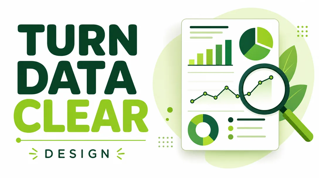
I will turn your data into a clear, beautiful infographic and data visualization
About this gig
I will turn your raw data into a clear, accurate, and beautiful infographic that makes your numbers easy to understand and ready to share anywhere.
If you have a spreadsheet, a report, or a tangle of statistics that nobody wants to read, I will translate it into a single, well-designed visual that communicates the point in seconds. Good data visualization is not about decoration. It is about clarity: choosing the right chart, removing the noise, and guiding the eye to what matters. I have spent years doing exactly that, and I take honesty in charts seriously. No misleading axes, no cherry-picked scales, no chartjunk.
What you get
- A custom infographic or data visualization designed around your specific data and message, not a recycled template.
- The right chart types for your numbers: bar, column, line, area, stacked, grouped, pie or donut (used sparingly and only when appropriate), scatter, bubble, treemap, funnel, gauge, comparison tables, simple maps, timelines, and process or flow visuals.
- A deliberate visual hierarchy so the most important figure reads first, supported by clear labels, a logical reading order, and concise annotations that explain what the data means.
- Clean typography, a considered color palette (including colorblind-safe options on request), consistent spacing, and alignment that looks professional at any size.
- Accurate data handling: I check your figures, flag anything that looks inconsistent, and make sure totals, percentages, and units actually add up before anything gets drawn.
- High-resolution exports ready to use: PNG and JPG for web and slides, and PDF for print or sharing. Vector SVG is available so your graphic stays crisp at any scale.
- Your brand applied properly when you provide it: logo placement, brand colors, and fonts, so the final piece looks like it belongs to you.
- A source or data note where appropriate, so your audience knows the figures are trustworthy.
This is a hands-on design service. I build the infographic for you from your data and direction; you receive finished, ready-to-publish files at the end.
Plans
| Plan | What it includes | Best for |
|---|---|---|
| Basic | One single-topic infographic or one focused chart built from data you provide (up to ~10 data points). Clean layout, your color choices, PNG and JPG export, one round of revisions. | A single statistic, a quick social post, or one chart for a report or slide. |
| Standard | One medium infographic combining 3 to 5 connected visuals (charts, key figures, short annotations) into a cohesive layout. Custom palette, light branding, PNG, JPG, and PDF export, two rounds of revisions. | A report summary, a marketing one-pager, or a data story with a few related points. |
| Premium | A full multi-section infographic or a small set of coordinated visuals telling a complete data story, with detailed annotations, full brand application, and editable source plus SVG and print-ready PDF. Three rounds of revisions. | A flagship report, an investor or sales asset, or a polished piece you will reuse and adapt. |
If your project sits between tiers or needs something custom (a series of matching graphics, an unusual data set, a specific print spec), message me first and I will tell you honestly which plan fits.
How it works
- You send me your data in any common format: Excel, CSV, Google Sheets, a PDF, a Word document, or even a clear screenshot or photo of a table. Plain numbers in a message are fine too.
- You tell me the goal: the single most important takeaway, who the audience is, where it will be used (slide, social, web, print), and any size or format requirements.
- I review the data, ask any clarifying questions, and propose the chart types and structure that will communicate your point most clearly. If something in the data looks off, I will raise it before designing.
- I design the first version, focusing on accuracy and readability first, then polish: color, type, spacing, and annotations.
- You review and request changes within the revision rounds included in your plan. I refine wording, layout, colors, and emphasis until it reads exactly the way you need.
- I deliver the final files in the formats your plan includes, ready to publish, present, or print.
Why choose this
I treat the data as the priority, not just the aesthetics. Plenty of infographics look striking but mislead, confuse, or bury the point. I start from the question "what should the viewer understand?" and design backward from there. That means choosing honest scales, labeling clearly, cutting anything that distracts, and making sure the standout number is genuinely the standout. The result is a graphic that is both attractive and trustworthy, one you can put in front of clients, executives, readers, or followers with confidence. I also communicate plainly, keep to scope, and flag issues early rather than surprising you at delivery.
Who it's for / use cases
- Marketers and content teams who need shareable, on-brand visuals for blogs, social media, newsletters, and campaigns.
- Analysts, consultants, and researchers turning findings into a summary stakeholders will actually read.
- Startups and businesses building pitch decks, investor updates, sales sheets, and annual or quarterly reports.
- Nonprofits and organizations communicating impact figures, survey results, or program outcomes.
- Educators, students, and writers explaining a concept or comparison visually.
- Anyone with a spreadsheet and a deadline who needs the story inside the numbers made obvious.
FAQ
Q: What format should I send my data in? Excel, CSV, or Google Sheets work best because they keep numbers structured. PDFs, Word documents, slides, and clear screenshots are fine too. If your data is messy or scattered, send what you have and I will help organize it.
Q: Can you match my brand? Yes. Provide your logo, brand colors (hex codes ideally), and fonts, and I will apply them consistently. If you do not have a brand kit, I will design a clean, professional palette for you.
Q: Do you check the data, or just design it? I review the figures for internal consistency, flag anything that looks wrong (mismatched totals, impossible percentages, unclear units), and confirm with you before designing. I do not invent or source data on your behalf; the underlying numbers come from you.
Q: What file formats will I receive? PNG and JPG on every plan, with PDF added on Standard and Premium, and editable SVG or source files on Premium. Tell me where you will use the graphic and I will export at the right size and resolution.
Q: Can I edit it myself later? The Premium plan includes editable source and SVG so you or your team can make changes. On Basic and Standard you receive finished image files; small text or number updates can be handled through a revision or a quick follow-up.
Q: How many revisions are included? Basic includes one round, Standard two, and Premium three. A round means you send all your change requests together and I apply them. Most projects are finished well within the included rounds.
Q: Can you make several matching graphics? Yes. For a set of coordinated visuals in a shared style, the Premium plan or a custom arrangement is the best fit. Message me with how many pieces you need and I will advise.
Q: What if I am not sure which chart to use? That is part of the service. Tell me your data and your main point, and I will recommend the clearest way to show it. Choosing the right visualization is exactly what I am here to do.
Reviews★4.5(6)
- @mintmind★★★★★5
I gave them a pile of numbers with almost no direction and they still produced a stunning, easy-to-read visual with the comparisons organized perfectly.
- @jackq★★★★★5
Turned my boring sales numbers into a clean chart-based visual that my whole team understood at a glance. Couldn't be happier.
- @alexg★★★★★3
The final infographic was accurate and readable, but I had to explain my layout idea a few times before it matched what I had in mind.
- @pixelcraft★★★★★5
Sent over a messy spreadsheet of survey results and got back an infographic that actually tells a story. The color palette and layout are gorgeous.
- @nick_hq★★★★★4
The data visualization looked great and the icons were a nice touch. Took one round of revisions to fix a couple of mislabeled figures, but the final version is solid.
- @irisi★★★★★5
Beautiful work. They took my raw CSV and made a single-page infographic that's so clear I'm putting it straight into my report.