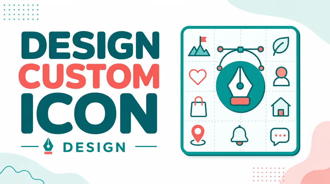
I will design a custom icon set and bespoke pictogram system
About this gig
I will design a custom icon set and bespoke pictogram system built on one consistent visual grammar, drawn from scratch to fit your exact product, brand, and screens.
What you get
This is a hands-on design service, not a stock pack or a recolored template. Every icon is drawn fresh against a shared grid and a documented set of rules so the whole set reads as one family rather than a pile of unrelated marks.
- A custom icon set covering the symbols you actually need (navigation, actions, status, categories, features, or domain-specific concepts you supply in a list).
- A unified pictogram system: a defined grid, stroke weight, corner radius, terminal style, optical sizing, and metaphor language that every icon obeys, so future icons can be added in the same style.
- Source vector files in editable form (Figma and/or Adobe Illustrator), with clean, named, properly grouped paths — no stray points, no unmerged shapes, no rasterized junk.
- Production exports in the formats you need: SVG (optimized), PNG at multiple resolutions (1x/2x/3x), and an optional icon font or sprite sheet on the higher tiers.
- Icons drawn on a consistent pixel grid (commonly 16/20/24/32 px artboards) and aligned to keylines so they sit evenly when placed side by side in a UI.
- Pixel-hinting and optical correction so each icon looks balanced at its target size, not just mathematically centered.
- A simple usage sheet explaining the grid, stroke rules, padding, do's and don'ts, and how to request or build new icons later.
- Light/dark or filled/outline variants where your project calls for them.
- Full commercial usage rights to the delivered artwork for your product, brand, app, website, print, or marketing.
Plans
| Feature | Basic | Standard | Premium |
|---|---|---|---|
| Number of custom icons | Small set | Medium set | Large set / full system |
| Single visual style (e.g. outline) | Included | Included | Included |
| Additional style variant (filled, duotone) | — | 1 variant | Multiple variants |
| Defined grid & stroke system | Basic rules | Documented system | Full guideline sheet |
| Source files (SVG + Figma/AI) | Included | Included | Included |
| PNG exports (1x/2x/3x) | Included | Included | Included |
| Icon font / sprite sheet | — | Optional | Included |
| Revision rounds | 1 | 2 | 3 |
| Delivery speed | Standard | Standard | Priority |
How it works
- Brief and icon list. You send me your list of concepts to illustrate, references you like, your brand colors/fonts, the target sizes, and where the icons will live (web app, mobile, print, signage). If your list is rough, I'll help you tighten it.
- Style exploration. I design a small sample of 3–5 representative icons in one or two directions so we lock the grid, stroke weight, corner treatment, and overall feel before I scale up. Approving the direction here keeps the whole set coherent.
- Full production. Once the direction is signed off, I draw the complete set against the agreed system, keeping metaphors consistent and optically balancing every mark at its target size.
- Review and revisions. I send a contact sheet showing every icon in context. You flag anything that feels off — a metaphor that's unclear, a weight that's heavy, a shape that's busy — and I refine within the revision rounds for your plan.
- Final delivery. You receive organized source files, optimized exports, and the usage sheet, packaged so a developer can drop them straight into the codebase.
Why choose this
A real system beats a grab-bag of icons. Because every symbol shares the same grid, stroke, and metaphor logic, the set looks intentional and professional, and it stays maintainable — when you need a new icon next quarter, the rules already exist to draw it in the same hand. I focus on legibility at small sizes, honest metaphors that users read instantly, and clean vectors that export without surprises. You get a designer who hand-draws each path, not an automated tracer, and who treats consistency as the core deliverable rather than an afterthought.
Who it's for / use cases
- SaaS and web apps that need a coherent navigation and action icon set matching their UI.
- Mobile apps needing crisp, pixel-aligned icons across tab bars, settings, and onboarding.
- Brands building a design system or component library that requires an owned, on-brand icon language.
- Wayfinding, signage, and pictogram systems for products, events, transit, packaging, or printed manuals.
- Dashboards and data products that need category, status, and feature symbols that scale across screens.
- Startups replacing mismatched free icons with one bespoke, consistent set before launch or rebrand.
FAQ
Q: Are these original icons or modified stock? Every icon is drawn from scratch against a custom grid and rule set built for your project. Nothing is traced from or repackaged out of an existing pack.
Q: What file formats will I receive? Editable source (Figma and/or Illustrator) plus optimized SVG and PNG at 1x/2x/3x. Higher tiers can include an icon font or sprite sheet for easy integration.
Q: Can you match my existing brand or UI style? Yes. Send your brand assets, a few screens, or icons you already use, and I'll align the grid, stroke weight, and metaphor style so the new set sits naturally alongside your existing design.
Q: I'm not sure exactly how many icons I need — can you help? Absolutely. Share the screens or features you're covering and I'll help turn that into a concrete icon list, including symbols you may have overlooked.
Q: Will the icons stay sharp at small sizes? They're designed on a pixel grid and optically corrected for their target sizes, so they read cleanly even at 16px rather than turning into mud.
Q: Can I add more icons later in the same style? Yes. That's the point of delivering a system and usage sheet — the grid and stroke rules are documented so the set extends consistently, and I'm available to draw add-ons whenever you need them.
Q: How do revisions work? After the full set is delivered as a contact sheet, you flag what needs changing and I refine within the revision rounds included in your plan. I'd rather get the style right early in the sample stage than make sweeping changes at the end.
Q: Do I own the icons? Yes. You receive full commercial usage rights to the delivered artwork for use across your product, brand, app, website, print, and marketing.
Reviews★4.7(3)
- @lucas_h★★★★★4
Really nice bespoke pictograms and the icons are crisp at small sizes, just took a couple of revisions to nail the visual style I had in mind, but the final set was worth it.
- @lucas_b★★★★★5
The icon set came back perfectly consistent in stroke weight and the pictogram system he built for our wayfinding signage is so clear that visitors instantly get it. Easily the best design purchase I've made.
- @works7★★★★★5
Delivered a clean set of custom icons that match our brand and even gave us a little guide on how the pictogram grid works.