I will create infographic data visualizations and chart designs
About this gig
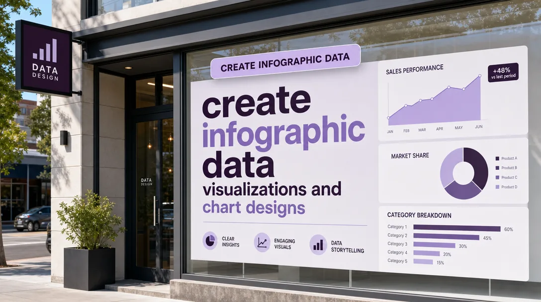
Turn raw numbers into clear, beautiful visuals. I design custom infographics, data-driven charts, and report graphics that make your data instantly readable and genuinely worth sharing.
What you get
I take your spreadsheet, survey results, report, or rough notes and turn them into polished, accurate visualizations built around your message. Every project is designed by hand, not auto-generated from a template, so the layout, hierarchy, and styling actually fit the story your data is telling.
- Custom infographic design built to your topic, audience, and brand, combining stats, icons, short copy, and visual flow into one cohesive piece
- Individual chart and graph designs, including bar, column, line, area, pie, donut, stacked, grouped, scatter, bubble, funnel, comparison, and timeline formats
- Data accuracy I can stand behind, with values plotted to scale and proportions kept honest (no misleading truncated axes unless you specifically ask and approve)
- Clean typographic hierarchy so the headline insight reads first and supporting detail reads second
- A custom color palette matched to your brand or built fresh for clarity and contrast
- Clear labels, legends, units, and source citations so the graphic stands on its own
- High-resolution exports in PNG and JPG, plus PDF on request, sized for your intended use (social, slide, web, or print)
- An editable source file (Figma, Illustrator/SVG, or layered file depending on the plan) so you or your team can update numbers later
- Print-ready output with proper resolution and bleed when print is the goal
If you tell me where the graphic will live (Instagram carousel, a pitch deck, a blog header, an annual report, a printed poster), I'll size and style it for that destination from the start, rather than handing you something you have to crop or rebuild.
Plans
| Feature | Basic | Standard | Premium |
|---|---|---|---|
| Best for | A single chart or simple graphic | A focused infographic | A full multi-section infographic or chart set |
| Custom charts/graphs | 1 chart | Up to 3 charts | Up to 8 charts |
| Infographic layout | Single element | One-page infographic | Multi-section / long-form infographic |
| Data points handled | Small dataset | Moderate dataset | Large / complex dataset |
| Custom color & styling | Standard | Brand-matched | Full brand system |
| Icons & illustration accents | Basic | Included | Extended set |
| Source / editable file | — | Included | Included |
| Print-ready export | — | Optional | Included |
| Revisions | 1 round | 2 rounds | 3 rounds |
| Delivery formats | PNG/JPG | PNG/JPG/PDF | PNG/JPG/PDF/SVG |
Not sure which tier fits? Send me your data and a sentence about where it's going, and I'll tell you honestly which plan covers it before you commit.
How it works
- You share the data and the goal. Send me your numbers (spreadsheet, CSV, doc, screenshot, or even a clear list) plus a short note on the single most important takeaway and where the graphic will be used.
- I review and ask questions. I confirm units, time periods, and which comparisons matter, and flag anything in the data that looks inconsistent or unclear before I start designing.
- I propose a direction. For larger projects I'll suggest the chart types and overall layout structure so we agree on the approach before full design begins.
- I design the first version. I build the visualization with proper scale, hierarchy, labeling, and your color/brand styling, then deliver a preview for your feedback.
- We refine. You review for accuracy and look-and-feel, and I apply revisions within your plan's revision rounds.
- I deliver final files. You get the final high-resolution exports plus the editable source file (Standard and Premium), ready to publish or print.
Why choose this
Most data graphics fail in one of two directions: they're accurate but ugly and hard to read, or they're attractive but distort the numbers. I aim for both at once, treating the chart as a design object and the data as something to be respected. I keep axes honest, label clearly, cite sources, and make sure the headline insight is the first thing a viewer sees.
I also work to a brief rather than to a template, so the result matches your audience and channel instead of a generic stock look. You get an editable file on the Standard and Premium plans, which means you're not locked into me for every future tweak. And I'll tell you up front if your dataset needs a different approach than you expected, because a clear "this chart type will read better" beats a polished graphic that misleads.
Who it's for / use cases
- Startups and founders building pitch decks that need credible, clean metric slides
- Marketing and content teams producing social infographics, blog headers, and shareable stat graphics
- Analysts and consultants turning findings into client-ready report visuals
- Researchers, students, and nonprofits presenting survey results and study data clearly
- Annual reports, whitepapers, and one-pagers that need a consistent, branded chart system
- Sales and product teams visualizing comparisons, growth, funnels, and timelines for stakeholders
FAQ
Q: What format should I send my data in? A spreadsheet (Excel or Google Sheets) or CSV is ideal because the numbers are unambiguous. A clear table in a doc, a labeled screenshot, or a tidy list also works. The cleaner the input, the faster and more accurate the result.
Q: Can you match my brand colors and fonts? Yes. Send your brand guidelines, hex codes, or logo, and I'll build the palette and typography to match. If you don't have a brand kit, I'll design a clean, high-contrast scheme that reads well.
Q: Will the charts be accurate to the actual numbers? Yes. Values are plotted to scale and proportions are kept truthful. I avoid misleading techniques like truncated or distorted axes unless you specifically request and approve a stylistic choice, and even then I'll note it.
Q: Do I get an editable file? On the Standard and Premium plans, yes. You'll receive a source file (Figma, Illustrator/SVG, or layered file) so you or your team can update the numbers later. The Basic plan delivers flattened image exports.
Q: Can you make this print-ready for a poster or report? Yes. Tell me the final print size and I'll deliver high-resolution output with proper resolution and bleed. Print-ready export is included on Premium and available as an option on Standard.
Q: How many revisions are included? Basic includes 1 round, Standard 2 rounds, and Premium 3 rounds. A revision round covers adjustments to the design I've delivered. Changing the underlying dataset or scope after approval may be handled as a new request.
Q: I have a lot of data and I'm not sure what to show. Can you help? Yes. Share everything and tell me what decision or message the graphic should support, and I'll recommend which numbers to feature and which chart types communicate them best. Focusing the story is part of the job.
Q: Can you create animated or interactive charts? This service covers static, designed visualizations and infographics delivered as image, PDF, and SVG files. Static SVG is included on Premium, but motion graphics and live interactive dashboards are outside this scope. Message me first if that's what you need.
Reviews★4.4(7)
- @finn_writes★★★★★3
The final infographic on our logistics KPIs looked great, but the back-and-forth took longer than expected and I had to clarify the data sources a couple of times before we landed on the right metrics. Solid end result, just a slower process than I hoped.
- @mayav★★★★★4
Hired them to redesign some old financial charts for an investor update. The new line and area visualizations are far more polished than what I had, and the revenue vs burn comparison reads clearly now. Responsive throughout the revisions.
- @mintmind★★★★★5
Turned my raw clinical study data into a publication-ready figure set. Precise, properly scaled, and the legend was exactly what the journal wanted.
- @eli_l★★★★★5
Sent over a messy spreadsheet of our SaaS churn numbers and got back a clean, beautifully laid out infographic that actually told a story. The flow between the funnel chart and the cohort breakdown made it obvious where we were losing users.
- @alexg★★★★★5
I'm a market researcher and needed survey results visualized for a client deck. The seller mapped my crosstabs into a clean set of stacked charts and a summary infographic. Communication was constant and they asked smart questions about my audience before starting.
- @alexp★★★★★5
Used this for our nonprofit's annual impact report. The donation trends and program reach were turned into really approachable charts that our board immediately understood. Quick turnaround too, had the first draft in two days.
- @lunarcraft★★★★★4
Good work on the e-commerce sales dashboard graphics. The bar and donut charts matched our brand colors nicely. Only reason it's not a 5 is I had to ask twice to get the axis labels readable on mobile, but they fixed it without complaint.